
First Component
Components let you reuse UI structure. A component is a template declared in components within qorm.json; inside the template, {{ prop.x }} reads the properties passed in by the instance. Instantiate it with a node whose type equals the component name.
Declaring a component (qorm.json)
{
  "type": "app",
  "id": "my_app",
  "entry": "main",
  "components": {
    "user_card": {
      "type": "card",
      "style": { "padding": 16, "gap": 4 },
      "children": [
        { "type": "text", "text": "{{ prop.name }}",  "style": { "fontWeight": 700 } },
        { "type": "text", "text": "{{ prop.email }}", "style": { "color": "#8e8e93" } }
      ]
    }
  }
}
Using a component (scene)
The node's type is the component name; properties are written directly on the node as ordinary fields.
{ "type": "user_card", "id": "u1", "name": "Ada", "email": "[email protected]" }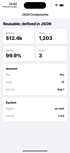 Components declared once in JSON — metric tiles and key/value panels — reused across a screen (
examples/uikit).
Slot (filling in child content)
Place a { "type": "slot" } placeholder in the template; the instance's children are filled into it.
"components": {
  "panel": {
    "type": "card",
    "style": { "padding": 16, "gap": 6 },
    "children": [
      { "type": "text", "text": "{{ prop.title }}", "style": { "fontWeight": 800 } },
      { "type": "slot" }
    ]
  }
}
The instance passes children to fill the slot:
{ "type": "panel", "id": "acct", "title": "Account", "children": [
  { "type": "text", "text": "Plan: Pro" },
  { "type": "text", "text": "Seats: 12" }
] }
Passing live data as props
A prop value may be a binding. It is evaluated once in the instance's scope — so {{ state.x }}, {{ item.x }} and route params all resolve — and the result keeps its type: a boolean stays a boolean, a number stays a number, a list stays a list.
{ "type": "stat_card", "id": "cpu",
  "label": "CPU",
  "value":  "{{ state.metrics.cpu }}",
  "warn":   "{{ state.metrics.cpu > 80 }}",
  "series": "{{ state.metrics.history }}" }
Inside the template those props work as real values, not as text:
{
  "type": "column",
  "children": [
    { "type": "text", "text": "{{ prop.label }}: {{ prop.value * 100 }}%" },
    { "type": "text", "if": "{{ prop.warn }}", "text": "High" },
    { "type": "list", "data": "{{ prop.series }}",
      "renderItem": { "type": "text", "text": "{{ item }}" } }
  ]
}
Because a component instance can sit inside a renderItem, this is what makes a component usable as a list-row template — pass {{ item.… }} straight in.
If you prefer to keep props apart from the node's own fields, write them under a nested props object; those keys win over top-level keys of the same name.
{ "type": "stat_card", "id": "cpu", "props": { "label": "CPU", "value": "{{ state.cpu }}" } }Callback props
An invoke's name may itself be a binding, so a component can accept the action to run as a prop. The name is resolved when the handler is registered, so the button dispatches the real action:
"components": {
  "confirm_bar": {
    "type": "row",
    "children": [
      { "type": "button", "id": "ok",     "text": "{{ prop.okLabel }}", "onPress": { "name": "{{ prop.onConfirm }}" } },
      { "type": "button", "id": "cancel", "text": "Cancel",             "onPress": { "name": "{{ prop.onCancel }}" } }
    ]
  }
}
{ "type": "confirm_bar", "id": "del", "okLabel": "Delete",
"onConfirm": "deleteItem", "onCancel": "closeDialog" }Named slots
A template may declare several slots by giving each a name, and the instance attributes each child to one with a slot field. Children with no slot fill the unnamed slot.
"components": {
  "frame": {
    "type": "column",
    "children": [
      { "type": "slot", "name": "header" },
      { "type": "slot" },
      { "type": "slot", "name": "footer", "children": [
        { "type": "text", "text": "No actions" }
      ] }
    ]
  }
}
{ "type": "frame", "id": "f1", "children": [
{ "type": "text", "text": "Account", "slot": "header" },
{ "type": "text", "text": "Body copy" },
{ "type": "button", "text": "Save", "onPress": "save", "slot": "footer" }
] }A slot's own children are its fallback — they render only when nothing fills that slot, so the frame above shows "No actions" when the instance supplies no footer child. A single unnamed slot still behaves exactly as before, so existing components keep working.
Declaring props and slots
A component can declare the interface it expects. Wrap the template in a definition object: template holds the root node, props declares the properties and slots the named slots.
"components": {
  "metric": {
    "props": {
      "label": "string",
      "value": { "type": "number", "required": true },
      "unit":  { "type": "string", "default": "pts" }
    },
    "slots": { "header": { "required": false }, "body": { "required": true } },
    "template": {
      "type": "column",
      "children": [
        { "type": "slot", "name": "header" },
        { "type": "text", "text": "{{ prop.label }}" },
        { "type": "text", "text": "{{ prop.value }} {{ prop.unit }}" },
        { "type": "slot", "name": "body" }
      ]
    }
  }
}
A prop is declared either by its type alone ("label": "string") or by an object with type, default and required. Types are string, number, boolean, array, object and any.
What a declaration buys you:
- Defaults — a prop the instance omits renders as its declared
default
({{ prop.unit }} above is pts unless the instance passes one). A default is a literal from the definition, not an expression evaluated in the instance's scope, and it never satisfies required — a required prop is always the instance's job.
- Load-time checks — a missing
requiredprop or slot is an error, a
literal value that cannot satisfy its declared type is an error, and a key in the instance's nested props object that the component never declared is a warning. Bindings ({{ state.x }}) are only known at render time, so they are never type-checked here.
- Expression checking inside the template — declared prop types join the
template's type checker, so {{ prop.label * 2 }} on a string prop is caught.
Declaring nothing keeps the old behaviour: every key is passed through and nothing is checked, so components written before declarations existed are unaffected.
Components in their own file
A component may also live in its own document — by convention components/<name>.json, next to scenes/ and actions/. Use type of "component", put the component name in id, and the same props / slots / template fields apply:
{
  "qorm": "0.1",
  "type": "component",
  "id": "panel",
  "props": { "title": "string" },
  "slots": { "body": { "required": true } },
  "template": {
    "type": "card",
    "children": [
      { "type": "text", "text": "{{ prop.title }}" },
      { "type": "slot", "name": "body" }
    ]
  }
}
Component files and the manifest's inline components map fill the same registry, so an instance uses either the same way. Defining one name twice is a load-time error (the first definition wins, and the manifest is read first).
Besides {"type": "panel"}, an instance may name the component explicitly with ref, which also accepts the canonical component:// form:
{ "type": "component", "ref": "panel", "props": { "title": "Settings" },
  "children": [ { "type": "text", "text": "Body", "slot": "body" } ] }
ref may itself be a binding — "ref": "{{ item.widget }}" — resolved in the instance's scope, which is how one row template picks a different component per item. A bound ref cannot be checked at load time, and a ref that resolves to no component renders an empty container rather than the unknown-node placeholder.
The convention is components/<name>.json, but the split is driven by the document's type, so a component document can live anywhere in the app folder.
{{ prop.* }}is only visible inside the component template; a field of the same name on the instance is the value passed in.- Components can nest components (up to 32 deep); ids inside a template are suffixed per instance, so two instances never collide.
- Components have no local state or lifecycle of their own — they read the global store through the props you pass them.
- For a complete runnable example, see
examples/uikit(metric / kv / panel).